So, I was doing a watercolor workshop at a local park last summer, during my workshop this little girl sits on the table and begins to paint. Soon after, her dad comes by, curious to see what the workshop was about, he sits and observes all the little kids doing their activity. About a week after, he approaches me while I was cleaning up after a workshop, he starts talking to me about his passion for making Michelada juice out of scratch. He was kind enough to bring me a free sample. It was in a Clamato bottle, I asked if that is what it was. He responded, “that is my problem, I have a product, but I don’t have a logo. Can you help me with that?”
After I asked him a few questions about what he wanted his logo to be like, I started brainstorming, coming up with different ideas and creating a Mood Board.

For this Mood Board I used Milanote, cool efficient website that helps me keep things organized. I wanted to the logo to be modern with an illustration as the beer cup. Once I gathered some ideas from different places like Behance, I started sketching and brainstorming. I prefer to use my Surface Pro to do some quick sketches. I believe I used Clip Studio or Painter 19. I also use my Wacom Inkling and do sketches on a graph notebook.
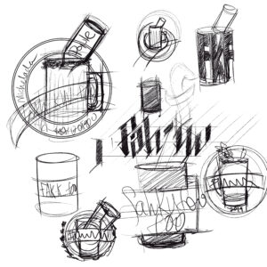
For the Michelada bottle, I wanted to create a quick comp using Photoshop on my Main Desktop. I needed to create it so I have an idea of what to illustrate.


Using Illustrator is always a challenge for me. While I have been doing graphic design work for over 10 years, and as a professional illustrator, I always feel like I use that software with my hands tied behind my back. I have all these ideas that I want to execute, but I find it difficult at times to get from point A to point B. Anyhow, Adobe has really added a bunch of features that make it easier for me to create vector art.
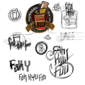
After some feedback from the client, he had a clear idea of what he wanted. So I began.
I really got into this logo because of all the colors that I was going to be able to use, all the saturated reds and oranges. After a few hours I created this piece.

The client LOVED it, but he wanted to make a few modifications. First, he plays baseball in a local league, so he wanted to incorporate some of those elements into the logo. He also wanted a baseball stitch element on it. Based on his feedback, I had to change it almost completely. As an artist, I hate seeing something really cool get changed, but that is what we do, we cannot let our preferences influence what the client wants. Afterall, it’s their logo and they have to love it. I did make a few suggestions, especially in terms of how much info he wanted to add to the logo.
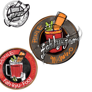
So back to the drawing board.

Here is the finished approved Logo. I feel like it has too much going on. The colors are neat, and I still got to keep the beer bottle, but I had to get rid of some of the elements like the lemons and the Tamarindo stick. Also, I like how the stitch makes it look like it is a baseball. There are a lot of things I learned from making this logo. I am not the best by a LOOOOOONG shot, but this was some good practice. I still like the first design.
In conclusion, I love this process of creating logos, sometimes the logo you like the best probably won’t get picked, but it was good for me to get some more experience. For years I always used Illustrator in the most minimal way, but this project really forced me to think differently, to see it as yet another tool to translate an idea into something visual.
